A look back at two decades of annual reports and where both style and substance fit going forward
Annual reports serve a legal purpose – to report on a company’s accounts and operations. But it has also become a graphic object that describes the company’s narrative in both words and design. The report is a central part of ‘telling the company story’, its business and sometimes the investment case, while also satisfying the needs of governance hawks. Using Sthlm Kom, we take a closer look at what graphic and design trends we can see in this ‘dry corporate document’ over the last 20 years.
Printed masterpieces
In the early 2000s, the annual report was often an exclusive print project, characterized by craftsmanship, choice of materials and visual ambitions. It was the marketing department that was in charge – often with a significant budget and a strong sense of form and design. In terms of content, however, it was not always so factually condensed and there was a nerve in the motto design rules over core content.
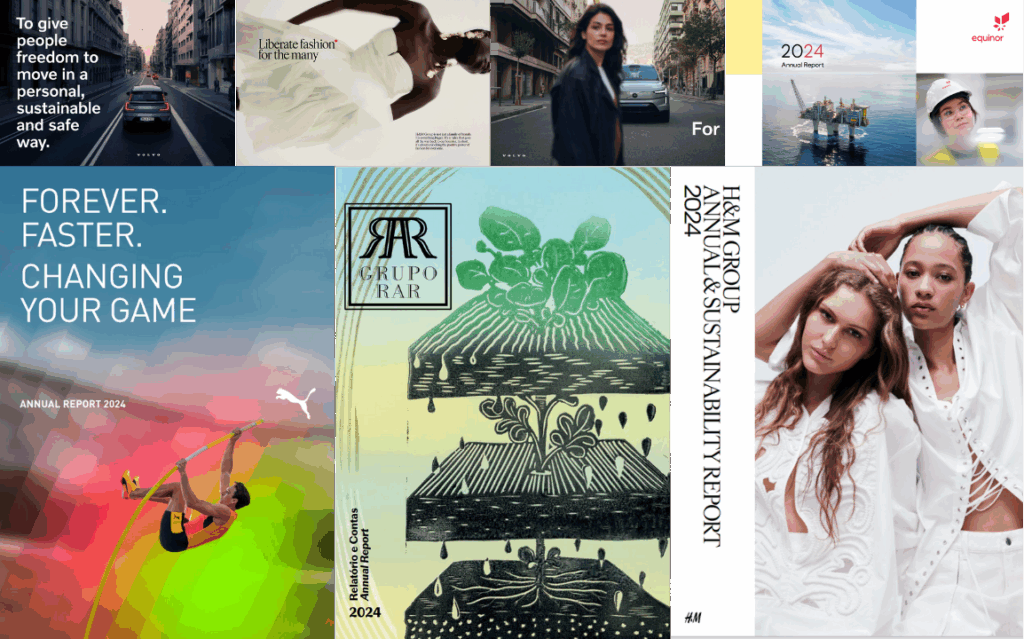
Since the late 2010s, reports have become more comprehensive and technical in terms of content. Production is more often the responsibility of the company’s finance department with a more functional, but less expressive product, as a result. Design ambition is sometimes replaced by the requirement for compliance.
The long-term winners in terms of communication and corporate brand building are probably the ones that find the balance between design and function, print and digital. Those who manage to combine the two in an appealing and functional way.
The format is changing – but the whole becomes more important
A clear design trend over the last five to seven years is the shift from portrait to landscape format – adapted for digital screen reading. Report design has become softer, warmer and more personal – arguably a reaction to the era we’re living in. Storytelling, illustrations and color choices are used to create an emotional connection to the company.
Technical developments have also changed. Image banks are of higher quality, AI-generated images are becoming more common and interactive functions in the digital PDF versions such as clickable graphs and video clips are increasingly integrated.
Trend or identity
The changes we see in annual reporting beg the question: should a company follow current design trends?
Not necessarily. General trends – such as landscape format, a minimalist layout or stock graphics – do not always equal good design. There is a difference between ‘fast fashion’ and sustainable design work.
The companies that succeed are those that maintain a clear, common thread over time. Consistency and quality create a strong brand expression – regardless of whether the report is landscape or portrait.
Five areas where development is most clearly noticeable:
- Infographics: Visualizations are used to simplify complex information, but their use places demands on both sender and recipient
- Storytelling: A clearer story about the company’s purpose and values must outweigh a more bloated report with a lot of compliance
- Sustainability: Integrated throughout the report, not just as a separate part
- Accessibility: The design should work on all devices and for all users, digital as well as print
- Interactivity: Digital features in PDF versions are increasing, such as clickable menus, graphs and video features.
Challenges and future reconnaissance
Many companies struggle with inconsistent design over time, which hinders recognition and risks damaging brand identity. There is also the risk of getting caught up in short-lived trends or letting budget dictate form over content.
Going forward, we see continued development in:
- An increased use of AI-generated images
- A focus on storytelling as a strategy
- A focus on accessibility (text alternatives for images, color contrast, for example)
- Interactive data visualizations with filter functions
- Animated graphs that show changes over time
A focus on simplicity and readability through minimalist design.


